Mapping 5,000 Years of Financial History and Geography
November 27, 2025
Where Expert Thought Leads the Conversation

BY PROFESSOR DARIUSZ WÓJCIK
Did you know that finance is more than 5,000 years old, but the first ever atlas of finance only one year old?
There are atlases of everything and anything. Atlases of beer, coffee, bells, phantoms, monsters, ghosts, cursed places, and countries that do not exist, but until a year ago, the world had no atlas of finance. How is it possible that cartographers, designers, writers, and publishers go to great lengths to create atlases on the most esoteric topics, but never attempted to use the atlas format to present finance, which permeates every nook and cranny of the world and transforms our daily lives?
The lacuna is even more puzzling, given that the history of maps is married to the history of finance. Many of the most influential atlases in history were conceived and published in the leading financial centres of their era, in cities like Venice, Antwerp, Amsterdam, and London. These places offered information, skills, and innovation to create the best maps, as well as money to pay for them, and yet they never managed to map money as the direct subject of the maps. Perhaps there was no atlas of finance because money and finance are considered too complex, arcane and technical to be mapped? And why have an atlas of finance now?
Uncovering patterns unseen before
First, maps can help us see patterns unseen before. Do you know who was the first person who suggested that given the shape of their coastlines, Europe, Africa, and the Americas could have formed one big continent in the past? It was Abraham Ortelius in the late 16th century, who spent thousands of hours creating the first ever modern atlas of the world in Antwerp, the financial capital of 16th century Europe. His observation was confirmed scientifically and emphatically over three centuries later with the theory of plate tectonics. The Earth’s land masses used to be joined together as a supercontinent called Pangea.
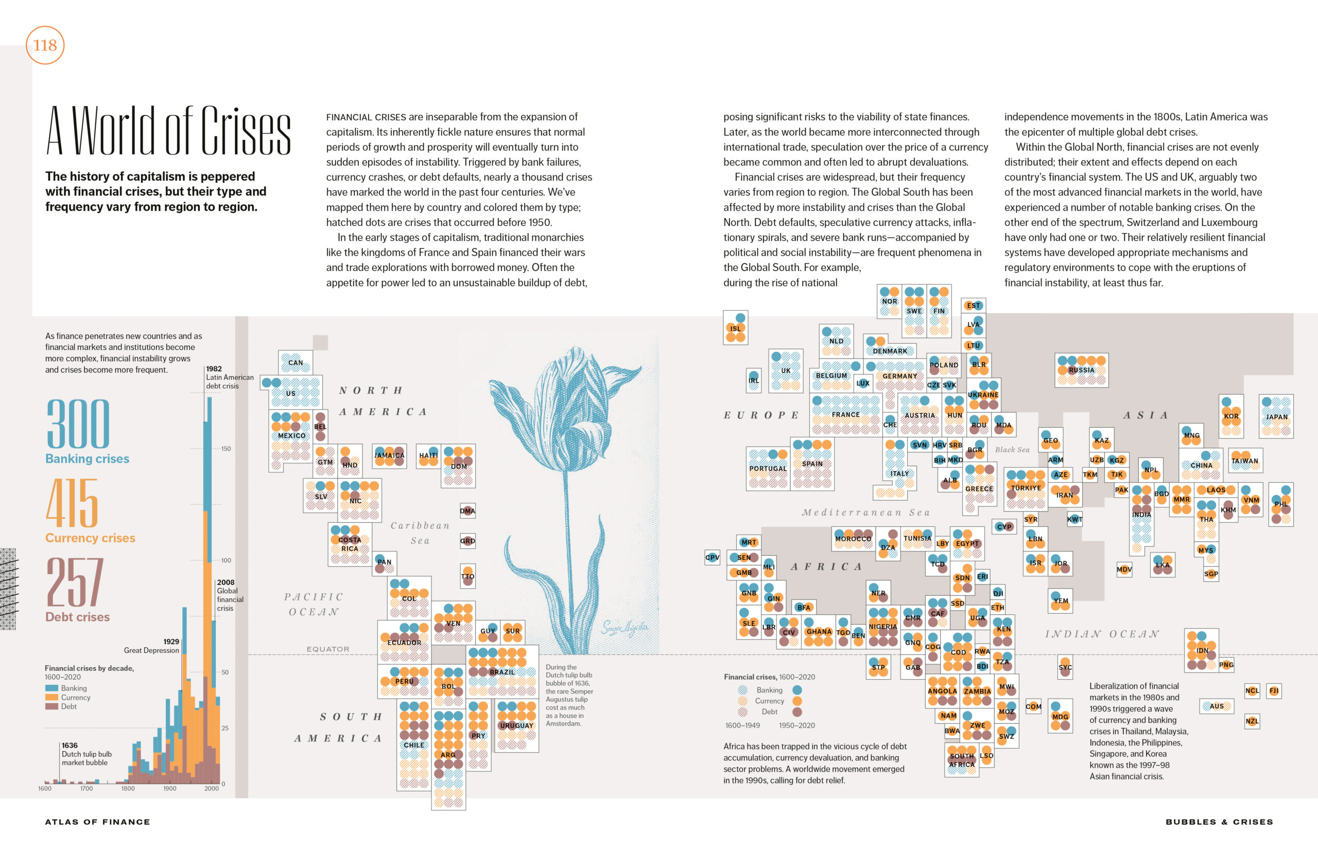
Atlas of Finance: Mapping the Global Story of Money shows an unseen before world map of all major financial crises since 1600 (figure 1). There are nearly 1,000 of them and the number is only rising with time. If anyone claims that new technologies and human skills can lower the frequency of financial crises, the historical record is stuck up against them. The growing size and complexity of the world economy only makes financial crises more likely. Europe, where financial innovation and economic growth accelerated in the 17th century, was until recently the epicentre of financial instability. Lately, this centre has moved to emerging economies, with Latin America and Africa in the lead.
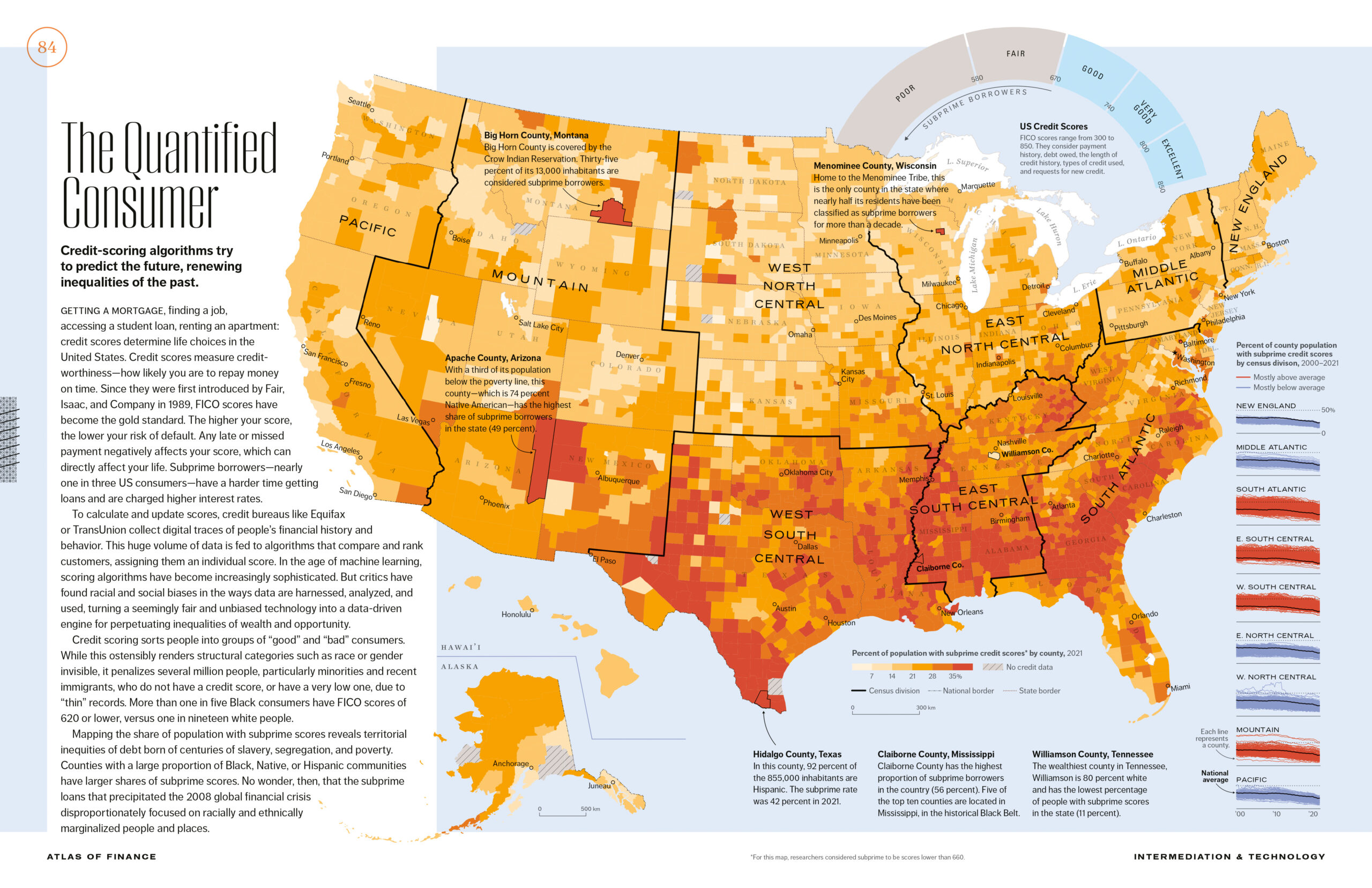
All financial crises are essentially caused by unsustainable credit that cannot be repaid in accordance with expectations. Hence, measuring creditworthiness has become a part of the financial industry. Figure 2 shows the percentage of the adult population with subprime credit scores in the USA by county. Big swathes of the map are red, with more than a third of people with zero or very limited access to credit. They concentrate in the historical black belt, centres of Hispanic immigration, and Native American reservations. While the map clearly reflects poverty and inequality, it also raises a question. Will credit scores that contribute to financial exclusion thus make this map look similar in 20 years? To what extent does financial technology reproduce inequality?
Revealing where finance comes from
Most money and finance come from credit, generated by our faith in and expectations about the future. But when and where exactly did finance start? The Atlas pins the origins of finance to the ancient Sumerian cities in today’s southern Iraq over 5,000 years ago. Clay tablets like that shown in figure 3 recorded the oldest transactions in history. Many of them documented agreements for the delivery of large amounts of barley over multi-year periods to produce beer. Payment for such wholesale deliveries would typically be settled with precious metals. As such, the tablets, ironically the size of today’s smartphone, were financial, accounting, and legal documents all in one.
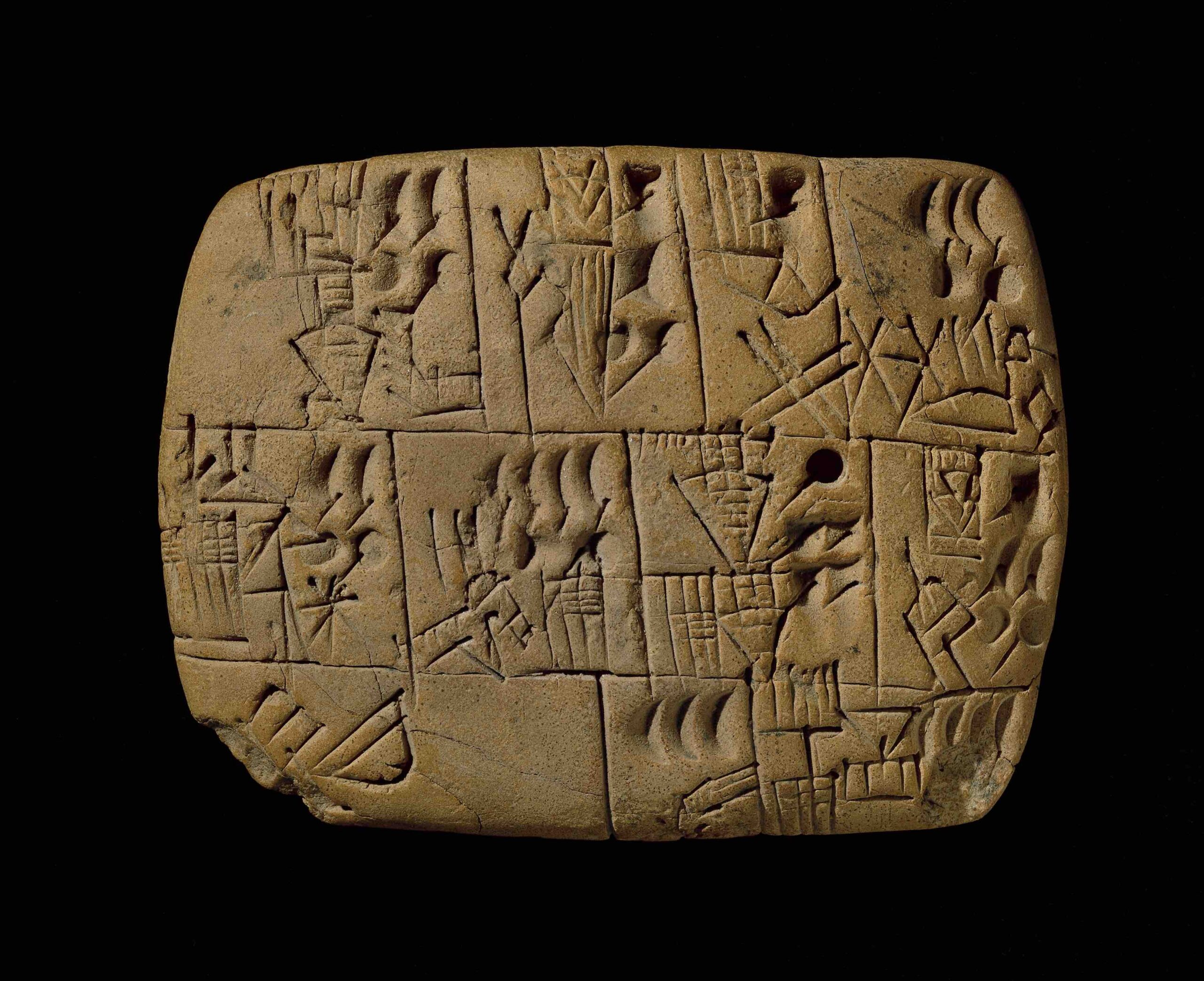
The Sumerian clay tablets formed a whole financial information system, with some of them showing maps of fields with estimations of yields and resources, including seeds, water, as well as the human and animal labour necessary to produce barley. This is another example of how the histories of finance and maps are joined at the hip. What is more, the tablets offer one of the oldest (if not the oldest) evidence of written numbers and language. Once numbers and language were born, the financial genie was out of the bottle, enabling the intensification of agriculture, the development of the first cities and city-states, and with time the emergence of empires.
Showing where money is going
War has always been a major destination of money. One of the Sumerian clay tablets recorded a demand for war reparations for 4.5 trillion litres of barley, a sky-high amount comparable to all barley harvested globally since 2000. The goal was obviously to make these reparations impossible.
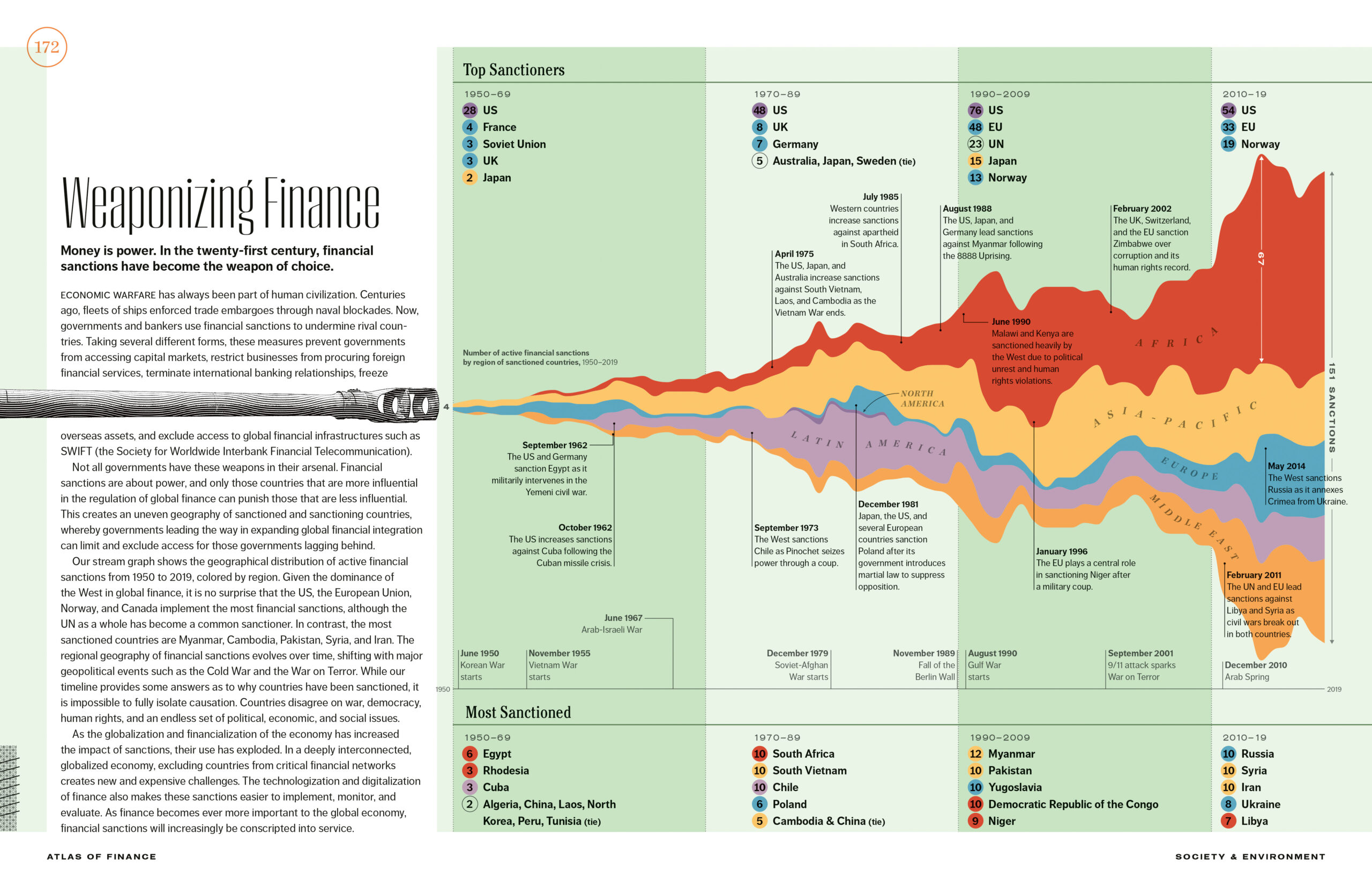
Today, financial superpowers continue to weaponise finance against others. As figure 4 illustrates, financial sanctions have proliferated since 1950. European nations and primarily the USA have frequently sanctioned the use of their currencies and access to the cross-border payment systems, which they control. African and Asian countries have been the most common target of such sanctions. Of course, they act as a double-edged sword. Not surprisingly, government efforts to make their economies less dependent on the British Pound, the Euro, and above all the US dollar, are most advanced in Africa and Asia.
An increasing amount of money goes to space, literally. The prospect of the space economy is attracting growing private, in addition to public, investment. But the geography of investors is very concentrated, with 80% of observational satellites orbiting the Earth as shown in figure 5, owned by entities in the USA and China alone. These satellites come with advanced technologies to track what is happening on the surface of the Earth and in its atmosphere, thus helping to manage resources and environmental change. But at the same time, they come with a threat of a new space race motivated by nationalistic military interests.

Looking to make finance better
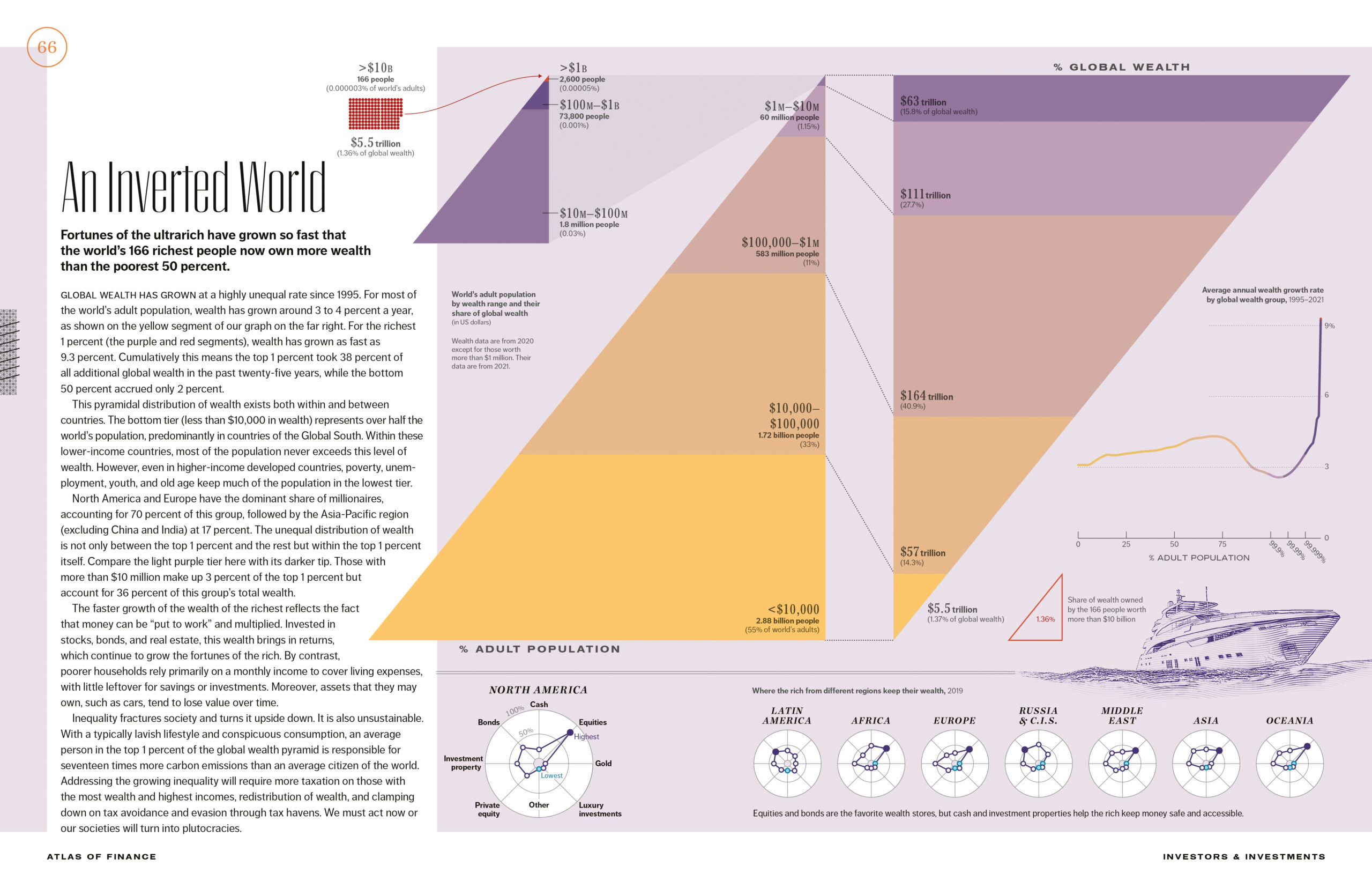
The purpose of mapping geographical data, whether using conventional projections or not, is to help us better understand the world, and ultimately create opportunities to make it better. As figure 6 shows, social injustice in the form of wealth inequality globally has grown over the last decades, with the wealth of the richest adults running away from the rest of the world population at the speed of compound interest. Already in 2021, the wealthiest 0.03% of adults, with more than USD 10 million each, owned 16% of global wealth, with their share increasing since. The world, as the figure shows, has been turned upside down.
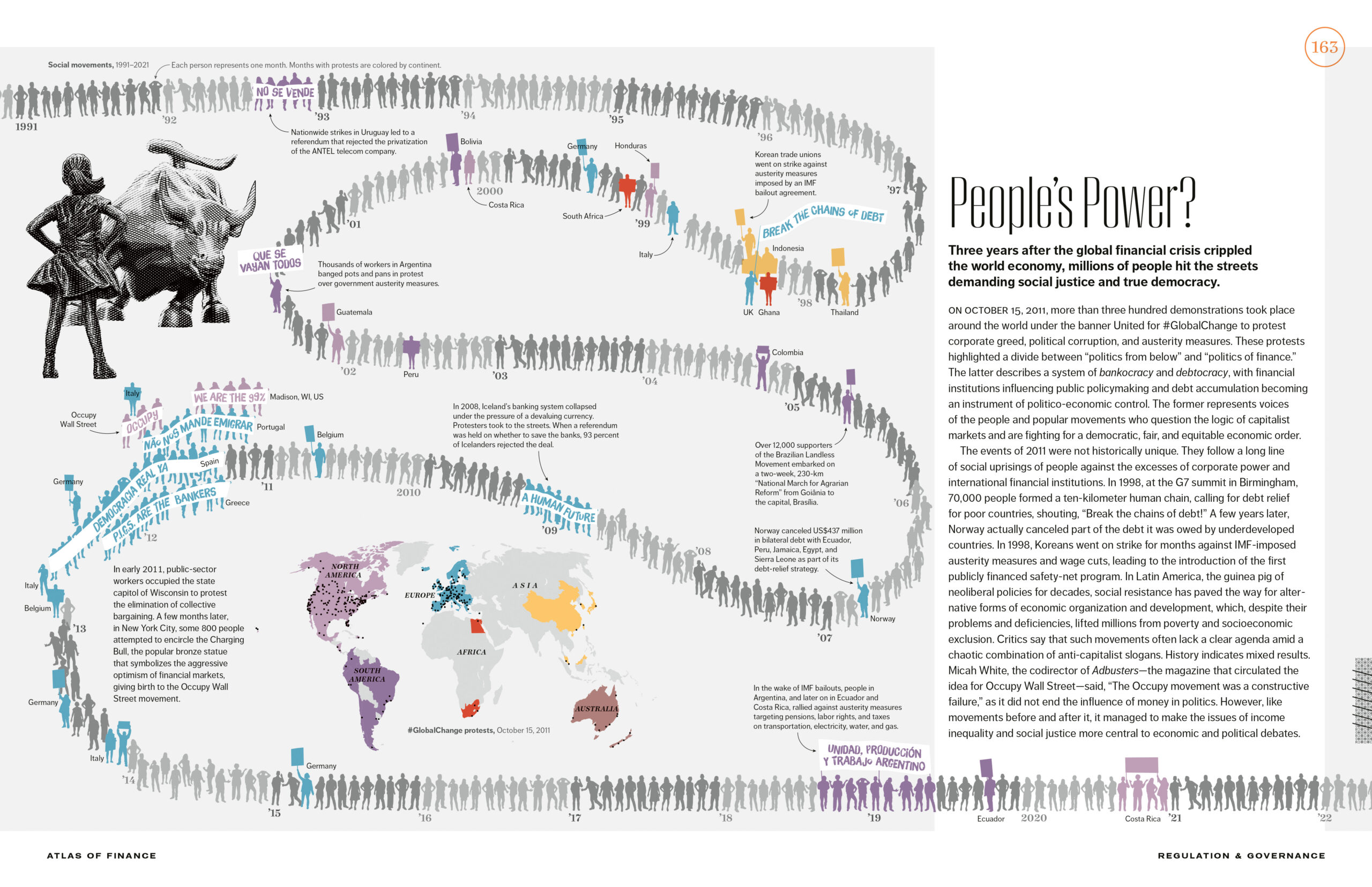
People are currently protesting against the growing plutocracy. Such protests, as figure 7 illustrates, can be global in scale. The endless chain of people risen against injustice is a visual call for solidarity on a global scale. Like the pyramids of population and wealth, the Atlas asks the reader and viewer to think about one humanity and our shared future. The first ever atlas of finance advances the argument that the road to improve finance leads through financial geography and visualisation. Mapping and visualisation involve research, help research, and communicate science and humanities. Atlas of Finance: Mapping the Global Story of Money is intended to break new ground on all these fronts.